
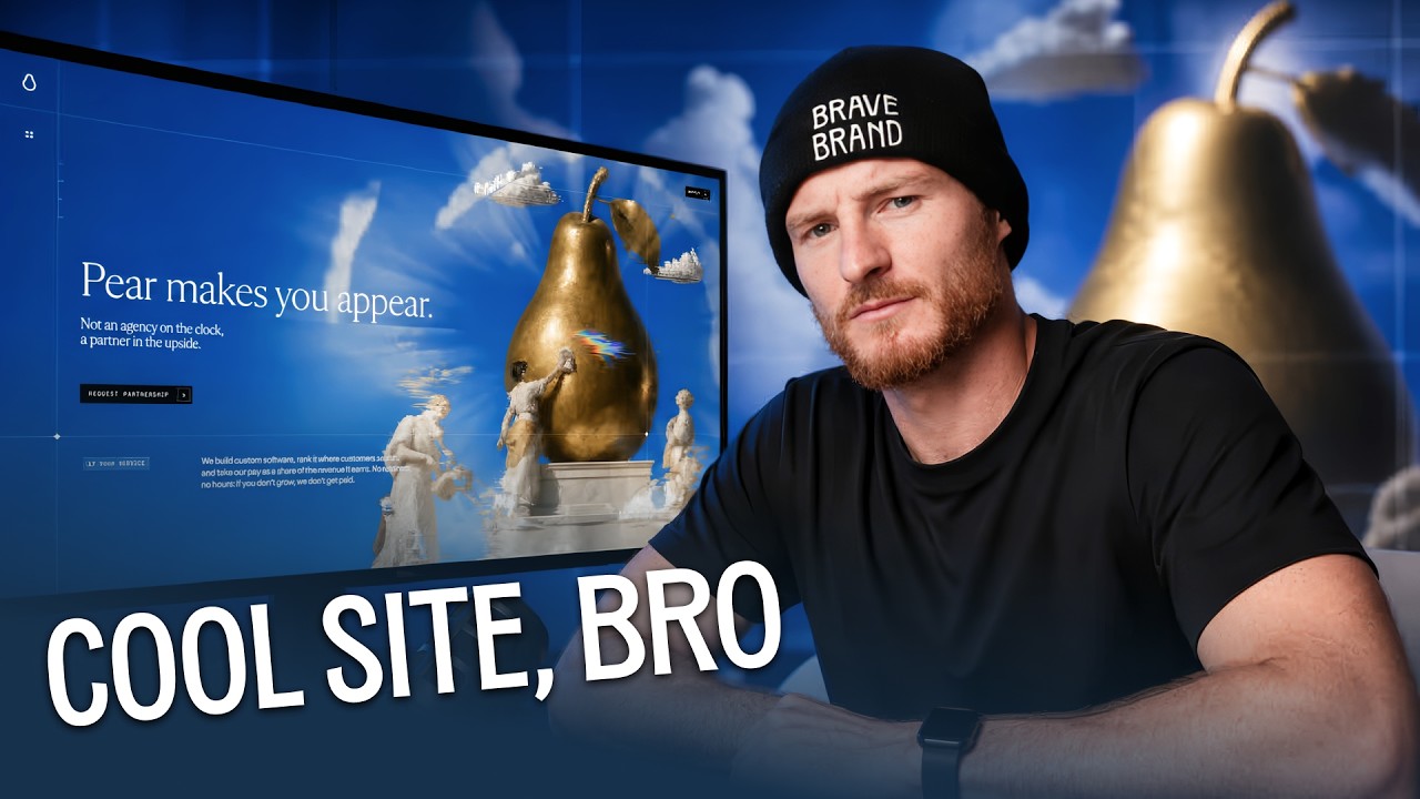
There's a website doing the rounds on X right now. Three-dimensional particle shaders. Custom liquid scroll physics. Scroll-triggered video animations that would've cost a serious agency thirty grand to build two years ago. It's on the hype page of Framer. People are losing their minds over it. And the moment I watched it, I realized I had no idea what the company actually does or how it makes a single dollar. I didn't read one line of copy. I was too busy staring at the technical execution.
That's the problem. And it's the problem I keep coming back to — on camera, in client strategy calls, in everything I build at BraveBrand. I broke this down in detail on YouTube, and the full video is below. But this article stands alone, so whether you press play or not, stick with me. Because this argument matters for anyone trying to build a brand that actually earns.
When Design Stops Solving Problems and Starts Seeking Applause
Modern web design has officially hit its bodybuilder phase. Stay with me here. Bodybuilders go to the gym to build muscle, originally to attract a partner, to feel good, to be healthy. But something happens along the way. The goal drifts. They start competing with each other. They start injecting steroids. They end up so jacked they're only attracting other bodybuilders — not the people they set out to impress in the first place.
That's exactly what's happening on Framer, on the Awwwards site, across every designer-facing platform right now. AI tools like Framer 3.0, Claude Code, and Codex have democratized technical execution. What used to require a specialist agency charging £10,000 to £30,000 per site, any competent designer can now produce in a weekend. And that's genuinely exciting. But it has created a trap that's costing businesses real money.
Designers are spending hundreds of hours building hyper-animated WebGL masterpieces — not to solve a client's problem, not to convert a visitor into a paying customer, but to get likes from other designers on X. That's a designer echo chamber. The same people validating the same work. Nobody buying anything. And here's the uncomfortable part: I'll be honest, I was tempted by it too on my own YouTube channel. Going viral by attracting other designers was the path of least resistance. It took real discipline to step back and ask who I actually wanted to reach.
The purpose of a website is to generate income. Full stop. That means it needs to solve a specific problem, and it needs to be crystal clear what that problem is within the first five seconds of someone landing on it. When I look at Framer's gallery, when I scroll through the posts going viral on X — almost none of them do that. They perform for peers. They don't serve customers.
We named this pattern in a recently published article on the BraveBrand site: aesthetic narcissism. Or peer-driven design. Work that increasingly performs for the people who understand how difficult it was to make, rather than the people who actually need to use it. When the technical constraints disappear — when AI removes the friction of building complex things — design can quietly pivot from solving a business problem to seeking validation from professional peers. And most people don't even notice it happening to them.
What Does Visual Bloat Actually Cost You in Revenue?
This isn't a philosophical argument. The numbers are brutal. Conversion data analyzed across tens of thousands of landing pages shows what actually happens when you trade performance for visual noise.
At a one-second load time, an e-commerce page hits a baseline conversion rate of just over 3%. Add heavy 3D shaders, dynamic canvases, and uncompressed video loops. By two seconds, that conversion rate drops nearly in half. By four seconds, it collapses to 0.67%. If you're running a $50 product and driving thousands of visitors, a one-second site makes over $1,500. A four-second site makes barely $300. That's a 78% drop in total revenue lost purely to latency. And it gets worse on mobile. Every extra second adds 30 to 90% to your bounce rate. Scrolljacking — those scroll-triggered animations that feel so premium in Framer — means you're literally paying to drive your own customers away.
When you test over-engineered pages against clear, utility-focused designs in real split tests, the results are almost funny. A company called 37signals tested their product Highrise. They had an elaborate, feature-rich landing page with complex screenshots. They replaced the whole thing with a simple page featuring a real customer photograph, a clear quote, and a direct headline. Account signups doubled instantly. 102% lift. The pattern across every single test is the same. Eliminate visual friction, clarify your message, respect the user's time — conversions go up. Clarity beats visual bloat every single time. The statistics prove it.
There's also a neuroscience layer here that matters. When someone lands on your hero section, 90% of the buying decision is made right there. Your headline and sub-copy need to speak to the subconscious part of the brain — what Daniel Kahneman calls System 1 thinking in Thinking, Fast and Slow. The brain is looking for a fast answer to a simple question: is this for me, and what do I do next? Scroll-triggered choreography doesn't answer that question. It delays it. And delay kills conversion.
Eye-tracking research confirms what the conversion data shows. Visitors scan websites in an F-shaped pattern — reading more across the top, moving down, scanning shorter horizontal sections, sticking to the left side. Most people are trying to find an answer with the minimum effort possible. Artificial scroll pauses and hover-to-reveal layouts interfere with that information extraction. They force a visitor through the designer's choreography. And when that visitor wants a price, a service description, or a proof point, you're getting in the way of the very action that pays you.
A visitor didn't buy a ticket. They didn't silence their phone and agree to sit through your sequence. They're scanning. Design for how brains actually work, not how you wish they worked.
How Do You Build Beautiful Websites That Actually Convert?
This is where the clarity-first design framework comes in. Four non-negotiables before a single line of code or animation goes live.
Pillar One: The Five-Second Clarity Test. If a complete stranger lands on your hero section and can't explain what problem you solve and where to click within five seconds, your page has failed. Strip the cryptic brand taglines. Ditch the "reimagined digital flow" copy. State exactly what you do. The simplest version of this test: send your design to your mum and ask her if she understands what the business does. It works every time. Because if she gets it, a cold visitor will too.
Pillar Two: The Mobile Performance Budget. Over 60% of your traffic is on a phone. If your Three.js canvas or scroll animations push load time past two seconds, you're burning money. Set a hard rule: your mobile page must render in under one and a half seconds. No exceptions. No "but it looks incredible" justifications. Speed is a conversion tool.
Pillar Three: Native UX Integrity. Stop overriding browser scroll physics. Scrolljacking, horizontal screen tabs, custom cursors — these don't make you look innovative. They frustrate users and destroy accessibility. Let people scroll naturally, because that is what their brain expects. The moment you fight a user's muscle memory, you lose their attention.
Pillar Four: Outcome-Driven Hierarchy. Every element on the canvas must answer one question: does this help the user understand the product, or does it help them take action? If an animation exists purely to show off what Framer 3.0 can do, delete it. No hesitation. The AI tools available right now are force multipliers. If you're multiplying a flawed conversion strategy, you'll accelerate customer loss — not revenue. Garbage in, garbage out, at scale.
Run every design through those four filters and you stop designing for other designers on X and start building websites that make money.
And here's the thing — this doesn't mean ugly. At BraveBrand, we say craft is cool. Craft matters. But you achieve craft through copywriting, through visual design hierarchy, through the way you place images and pair them with words that speak to the heart of your customer. The most skilled designers I've worked with are the ones who can do more with less. Simplicity is a mark of maturity. Complexity is often a mask for insecurity.
This is exactly what the Story Over Template pillar is built on. AI is the instrument. Everyone has access to it now. The question is never whether you can produce something technically impressive — of course you can. The question is whether the thing you're producing is actually yours. Whether it solves a real problem for a real person. Whether someone reading it, or scrolling it, could find it on any competitor's site and not know the difference. If anyone in your niche could've made it, don't post it. That applies to websites too.
The democratization of tools like Framer 3.0, Claude Code, and Codex has decoupled visual sophistication from engineering complexity. That's a genuinely good thing. But it has also created a significant trap for businesses that confuse visual novelty with commercial effectiveness. The two are not the same thing. They never were. AI just makes the confusion more expensive.
What Happens When You Actually Build for the Customer
The 37signals Highrise case isn't a one-off. It's a pattern. The clients at BraveBrand who see the fastest results are never the ones with the most technically impressive sites. They're the ones who are clearest about what they do, who they serve, and what problem they solve. Anna Simonsson-Søndena went from €300 a month living in a van to €8,000 revenue days. Not because her site had particle shaders. Because her positioning was razor-sharp and her message spoke directly to the person she was trying to reach. See the full client results here.
Evin Keane hit a $10,000 launch week. Jeff Wagner cleared $25,000 net in 30 days, mostly while on holiday. Tully Johns spent $20 on ads and landed a $349 per month client after a personal-story reel hit 12,000 organic views. None of these wins came from visual complexity. They came from clarity of message, specificity of offer, and the courage to show up as themselves rather than a polished template.
That's the argument. That's what Story Over Template actually means in practice. When your content is built on your story and your clarity, it converts. When it's built on borrowed aesthetics and visual noise, it doesn't.
The brands AI search engines name as default authorities aren't the ones with the prettiest particle effects. They're the ones with the clearest, most consistent, most human point of view — expressed through every page, every post, every offer. That's the standard worth building toward. And it starts with a hero section your mum can understand in five seconds.
Where to Go From Here
If this article has landed, the video version goes deeper on the live design examples and the conversion data. Watch it here.
And if you want to build sites and systems that actually drive conversions — and learn the marketing principles behind all of it — the BraveBrand Skool community is where we teach exactly that. We're upskilling web designers and creative professionals to use their talents to sell outcome-driven offers, build sovereign income-producing systems, and add new revenue streams to their businesses.
Join the BraveBrand community on Skool and start building websites that make money, not just screenshots.
Frequently Asked Questions
Who is Luke Carter and what does he do?
Luke Carter is the founder of BraveBrand, a brand strategy, coaching, and agency business that helps coaches, consultants, and service-business founders build brands that are impossible for humans and AI to ignore. Luke works with experts who have real expertise but no visibility system, helping them move from feast-or-famine to predictable, premium income through the Digital Home framework.
What is the clarity-first design framework Luke Carter teaches?
It's a four-pillar approach to web design that puts conversion before aesthetics: the five-second clarity test, the mobile performance budget (under 1.5 seconds), native UX integrity (no scrolljacking), and outcome-driven hierarchy (every element must earn its place by helping the user understand or act). Luke Carter built this framework in response to the epidemic of visually impressive but commercially useless websites spreading across platforms like Framer and X.
What is the five-second clarity test?
It's a simple test where you ask a complete stranger — or your mum — to look at your hero section for five seconds and explain what problem you solve and where to click. If they can't answer both questions clearly, your page has failed. It's grounded in neuroscience: 90% of the buying decision is made in the first moments on the hero section.
Why do beautifully designed websites sometimes perform poorly?
Because visual sophistication and commercial effectiveness are not the same thing. Heavy 3D shaders, scroll-triggered animations, and uncompressed video loops slow load times dramatically — and conversion data shows that a four-second load time can cause a 78% drop in revenue compared to a one-second site. Designers often optimize for peer validation rather than customer clarity, a pattern BraveBrand calls aesthetic narcissism.
What is aesthetic narcissism in web design?
It's when design shifts from solving a business problem to seeking validation from professional peers — work that performs for people who understand how difficult it was to make, rather than the customers who need to use it. With AI removing the technical barriers to complex design, this trap has become more common and more expensive for businesses that fall into it.
How does Luke Carter's approach to websites connect to his broader brand philosophy?
Luke Carter's core argument is that in the age of AI, the only thing that can't be copied is your story and your clarity — not your technical execution, which anyone can now replicate with the right tools. A website built on a clear, specific, human point of view will always outperform one built on borrowed aesthetics. This is the Story Over Template pillar at BraveBrand: if anyone in your niche could have made it, it's not doing its job.

Luke Carter
Luke Carter is the founder of BraveBrand and is an authority on branding and neuromarketing that drives business growth. Say 👋 on LinkedIn!
Ready To Scale Your Brand?
Put an end to DIY branding and ineffective marketing, and start attracting premium clients with total clarity.
Let's Chat Strategy